AutoCAD Mobile

Best-in-Class Accuracy for Touch-Controlled Input

Background

AutoCAD is a top-notch computer-aided design (CAD) platform, allowing architects, engineers, and designers to create precise drawings. While desktop users easily achieve precision with a keyboard and mouse, it becomes a bit trickier on touch-controlled devices. Moreover, upon its launch, the app didn't have a keyboard.
As a product designer, my mission was to create an exceptional accuracy experience for touch-controlled input, ensuring users could achieve the required precision without sacrificing performance or efficiency. This mission unfolded as an epic, comprising four different initiatives that I will describe here.
1st INITATIVE

Help users to find the keypad

At top, the app's initial launch was without a keyboard, sparking a crisis as users expressed dissatisfaction. They argued that the app became useless without the capability to input precise measurements for their drawings.
To address the storm of complaints, we quickly introduced a keyboard. While this solution was a quick fix, it allowed users to input exact values. However, the challange persisted, with only approximately 35% of users utilizing the keyboard, and complaints continued to come in.
In usability sessions, users were aware of the keyboard's existence. However, they faced difficulties in finding it. Understanding how to trigger it or what steps they should take.

Exploration: Signifying How to Trigger the Keyboard

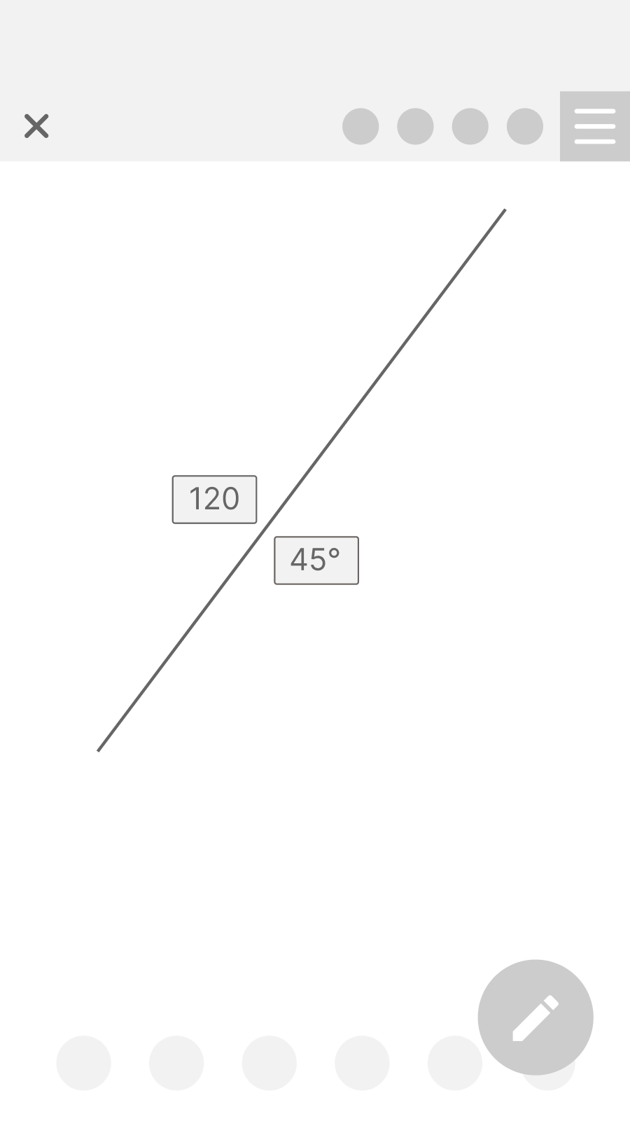
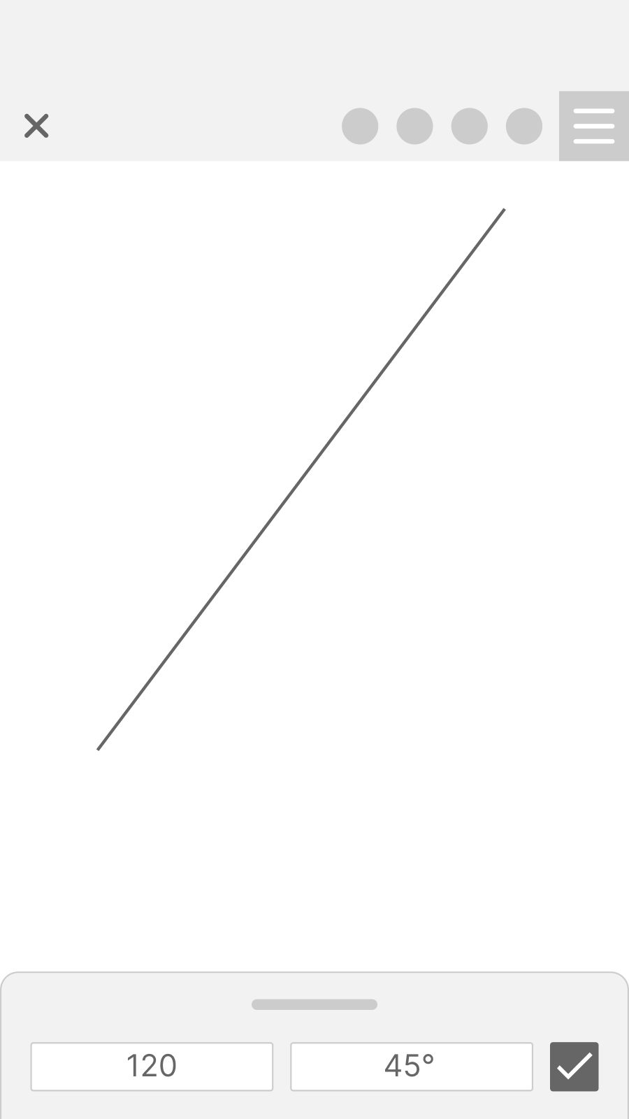
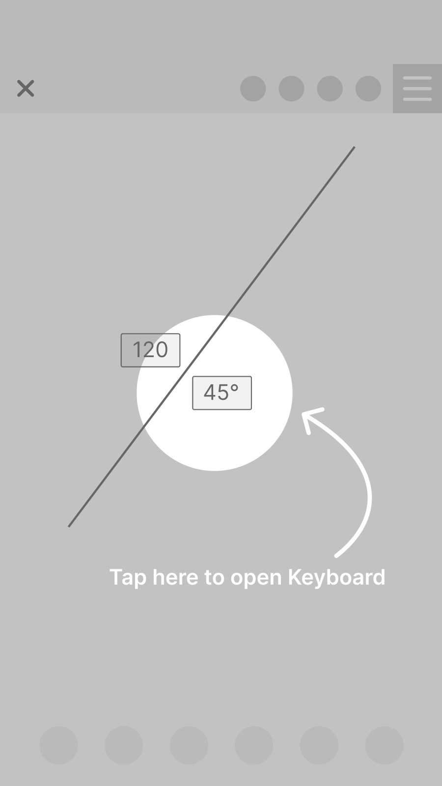
We conducted a thorough analysis of competitors and engaged in brainstorming sessions to select several solutions that can guide users on how to find the keyboard. We developed wireframes for these design patterns:
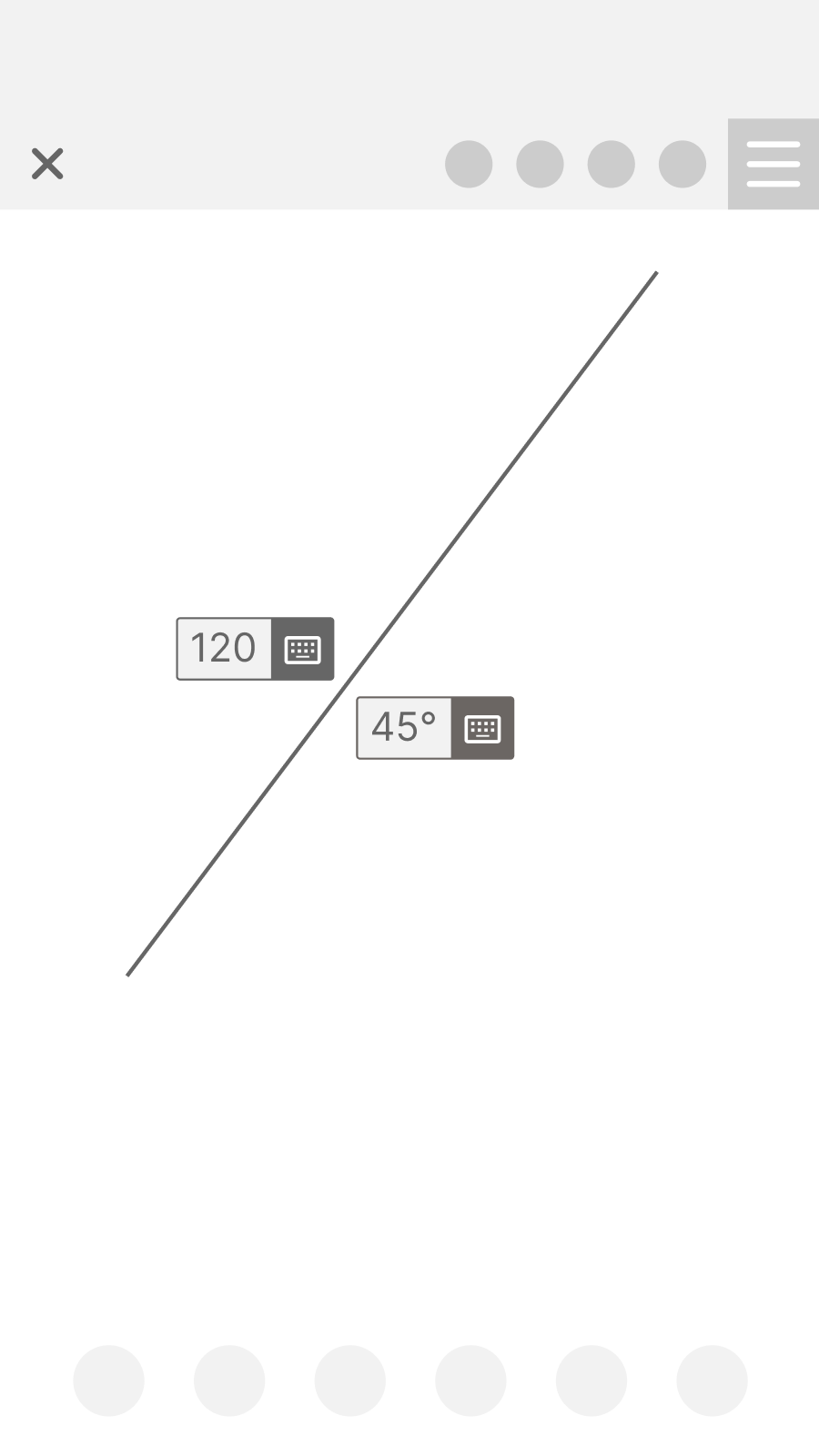
Add icon
FAB button
contextual bar
Coachmark onboarding

Solution: small icon with great impact

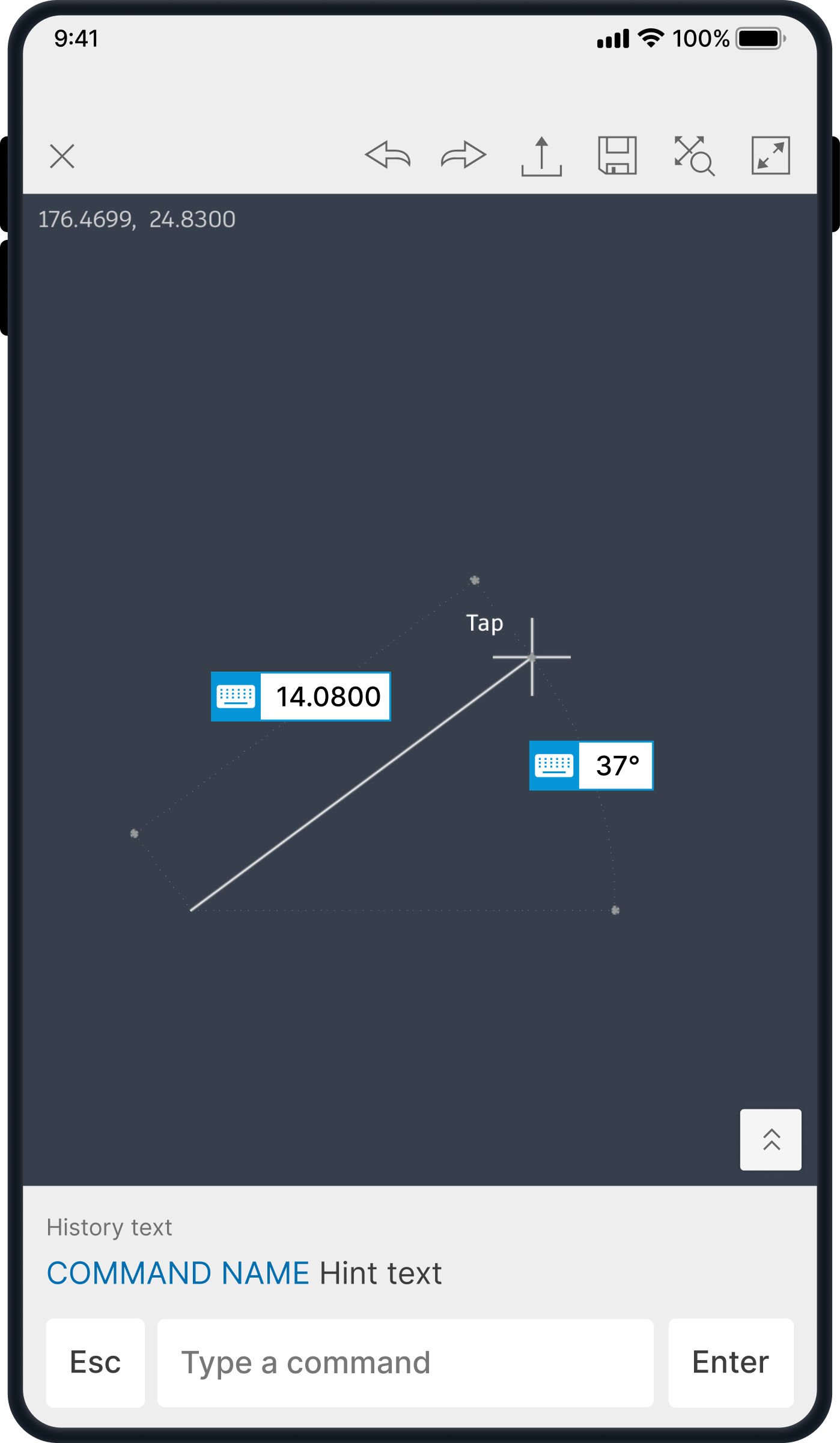
We tested adding a keyboard icon next to geometry in the dynamic input. This aligns with desktop behavior and has the lowest development effort. After A/B testing with keyboard, pencil, and no icon, we implemented the keyboard icon, achieving the highest user engagement.
2nd INITATIVE

Aligning with users mental model

After improving users' ability to find the keyboard, we conducted usability tests and found that after users entered dimensions, they expected to be able to continue moving or editing the shape, as they were accustomed to on the desktop version. However, the app behaved differently from their expectations due to the absence of a cursor indicating the current mouse position. As a result, users faced challenges, resulting in numerous mistakes. To recover from mistakes, the users had to  to delete and re-do the command.

Solution: “virtual” trackpad on the touch screen

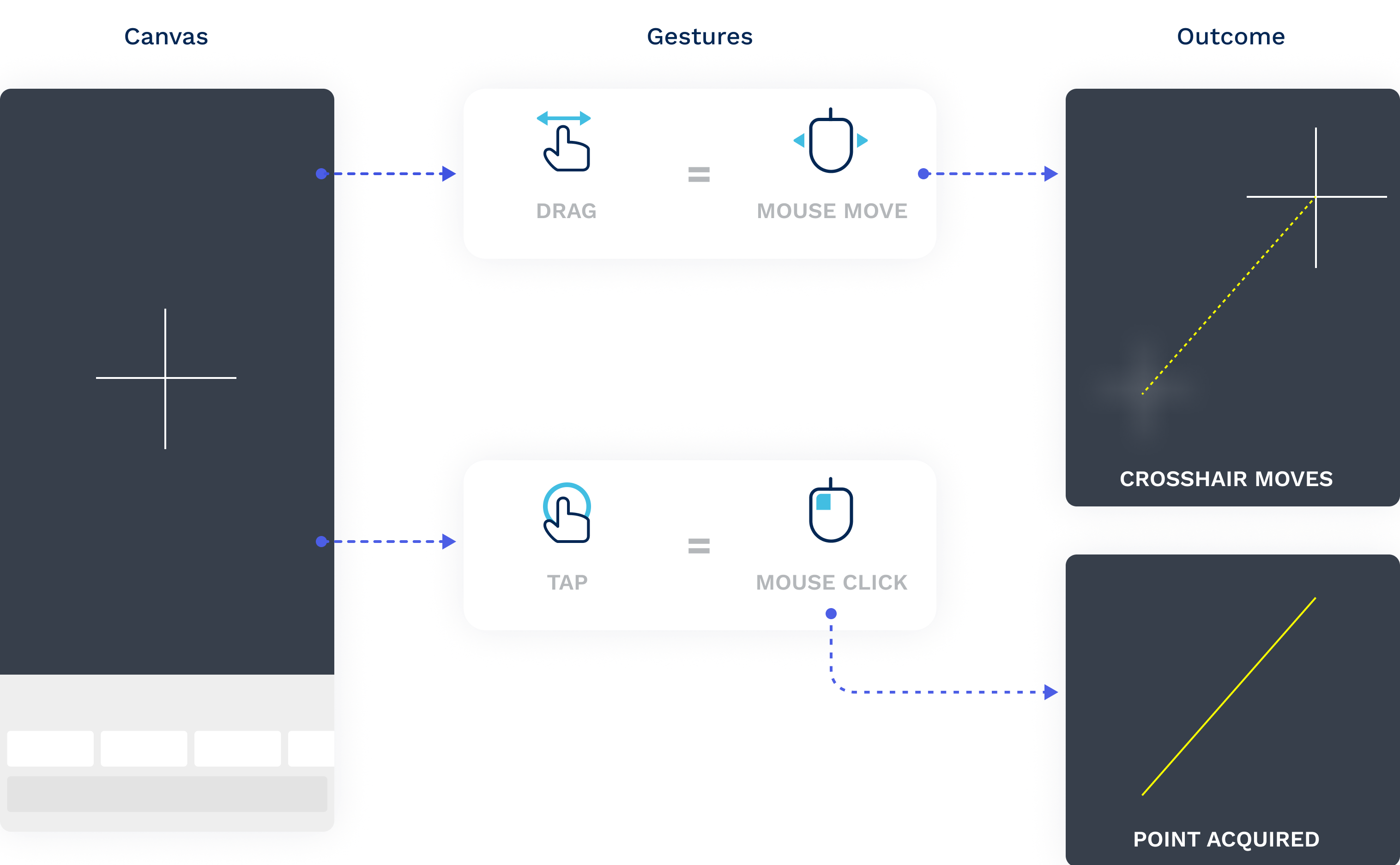
In response to the challenges identified during usability tests, we carefully considered solutions that wouldn't disrupt users' habits and expectations. After thorough consideration, we decided to reintroduce the cursor, a familiar element from the desktop version. In addition, we implemented an interaction model designed to mimic mouse behavior, ensuring a cohesive cross-platform experience.
3rd INITATIVE

Adding feedback for a better learning curve

When we implemented this interaction, users who grasped it showed excellent performance. However, the challenge arose as the majority struggled with a slow learning curve, hindering them from performing basic actions due to difficulties forming a clear mental model of the interaction.
In usability testing, users faced uncertainty in touch gestures. Even when they successfully executed a gesture, reproducing it for the next point proved challenging. Confusion persisted over point acquisition, resulting in users selecting the same point multiple times. Some sessions saw users prematurely ending commands without task completion.
It became evident that users lacked clear signs or guidance, making it harder to navigate touch gestures effectively.

Solution: The Cursor will indicate about current system state

To solve these issues, we added prompts to the cursor. This gave users clear feedback, guiding them on what actions they could take, showing restrictions, and confirming successful interactions. Our goal was to make the touch gestures more intuitive for a smoother and user-friendly experience.
The user sees instructions telling him when the cursor can be moved, and when a tap is acceptable. a ripple effect signifies a successful point acquisition
The cursor shakes when an invalid tap occurred
4th INITATIVE

Providing top-notch keypad

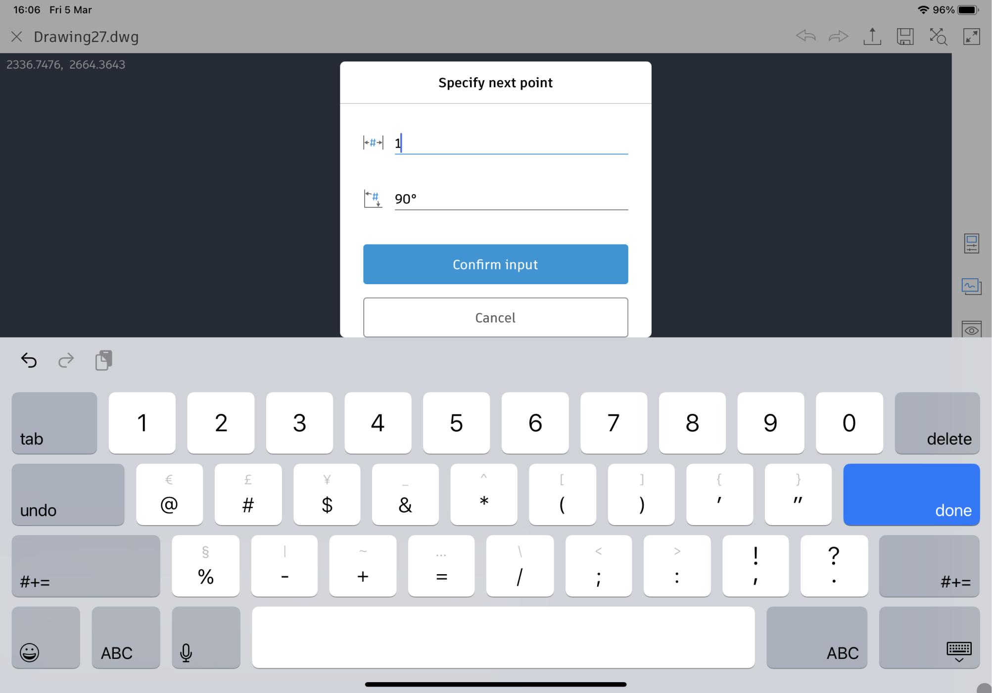
The last piece to complete this epic was to design a custom keyboard, ensuring a delightful and user-friendly interaction. To do that, we wanted to figure out what issues needed fixing. Going back to our research, we found the following problems:
BEFORE: Old design of the keyboard

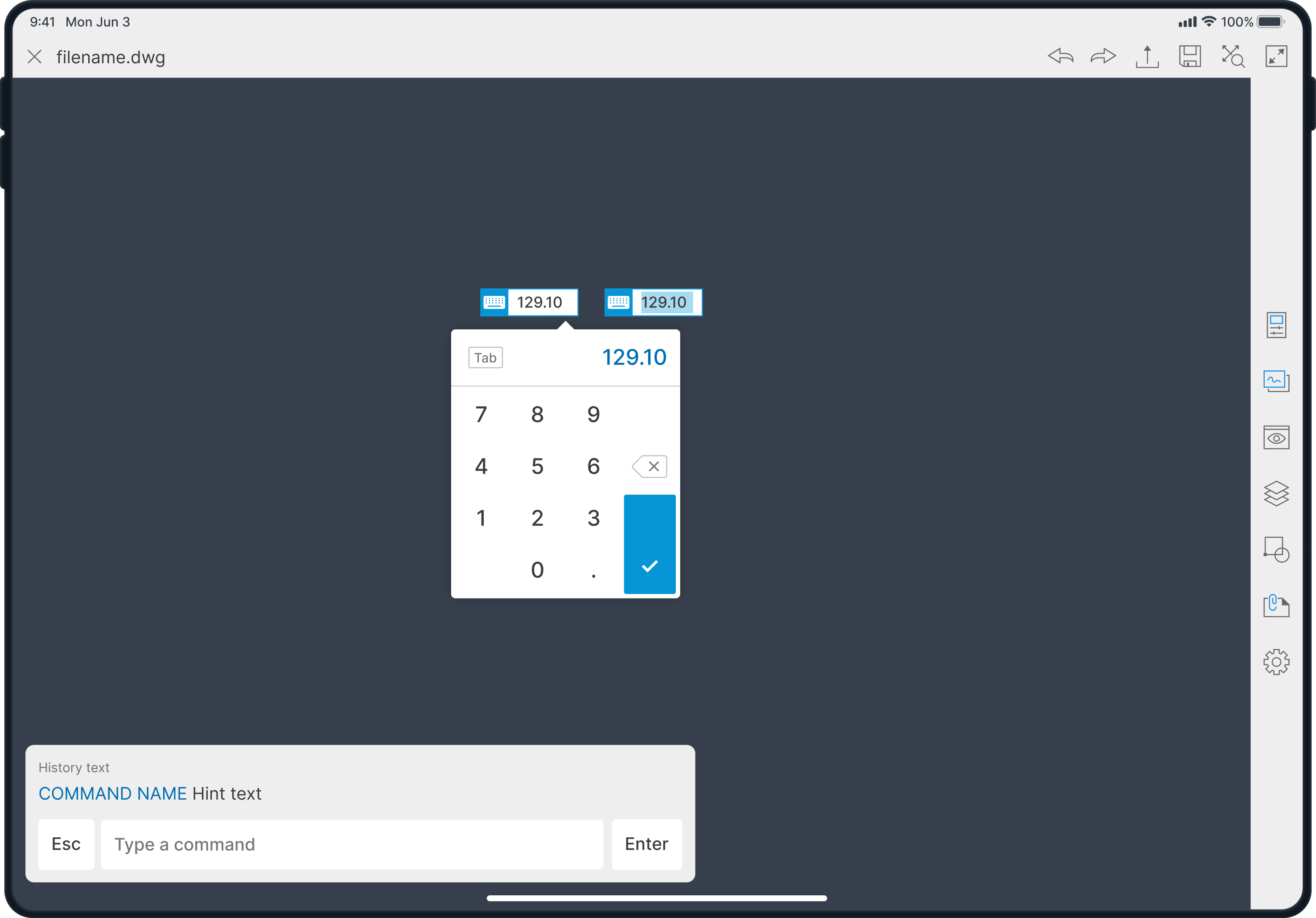
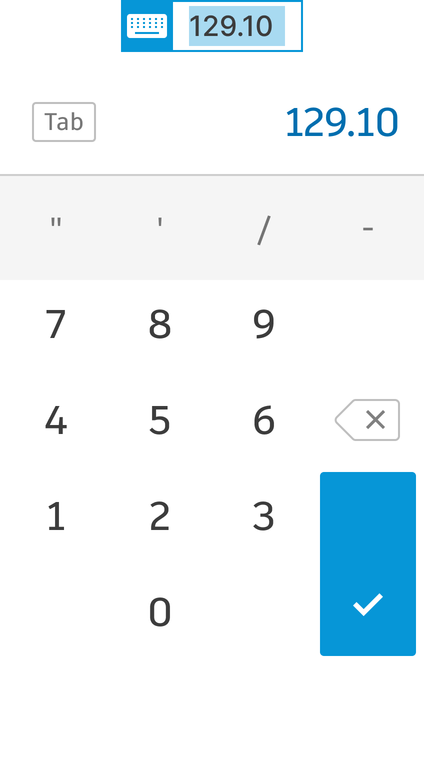
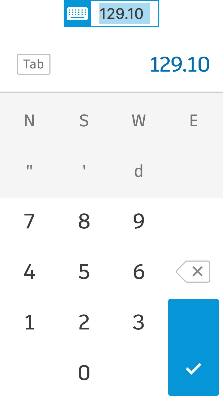
Solution: custom inline keypad

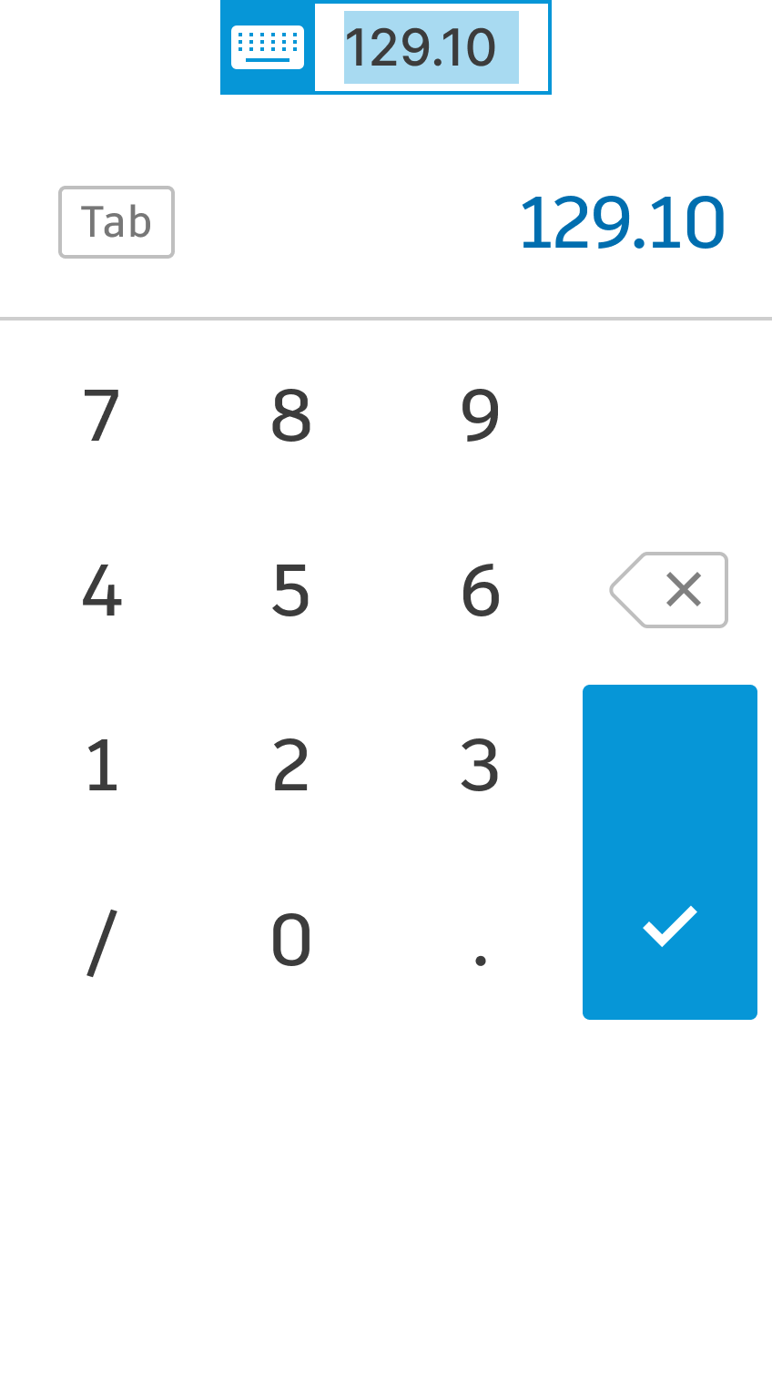
Our solution incorporates a custom inline keypad positioned next to the users' context, eliminating the need for them to look away or move their hand across the screen. Importantly, the keypad does not obstruct the screen, allowing for a live preview as users make changes.
To solve these issues, we added prompts to the cursor. This gave users clear feedback, guiding them on what actions they could take, showing restrictions, and confirming successful interactions. Our goal was to make the touch gestures more intuitive for a smoother and user-friendly experience.
Decimal
Fractional
Engineering
Surveyor's units
Validation

Results: better adoption and learnability

30%
Improvement to keypad awareness
In A/B testing, the new icon version showed an increase of ~30% to the proportion of users that uses the keypad in comparison to users that didn't have the icon.
30%
Increase in user adoption
After the new interaction model was introduced, the percentage of users opening at least four drawings in their first month rose from 13.34% to 15%.
~67%
Shorter learning curve
After adding the state feedback to the cursor, ~67% who made a mistake in the first acquired point, manage to acquire the second point without mistakes within 8 seconds.
With the state feedback, the percentage of points acquired by all touch users without any mistakes increased from 91% to 96%.