Optimove is a standout marketing automation tool. Its distinctive approach focuses on optimizing customer lifetime value through a multi-channel marketing hub enriched with data analytics and predictive modelling.
The project began with the acquisition of a mobile channels vendor. The business objective was to enhance the win rate in sales cycles by establishing Optimove as a leading marketing platform. The strategy centered on empowering CRM managers with tools to create omnichannel campaign.
I was part of a team including a product manager, developers, and QA engineers, my focus was on two key UX objectives: seamlessly integrating new channels into the platform and developing a scalable interface for easy future enhancements.
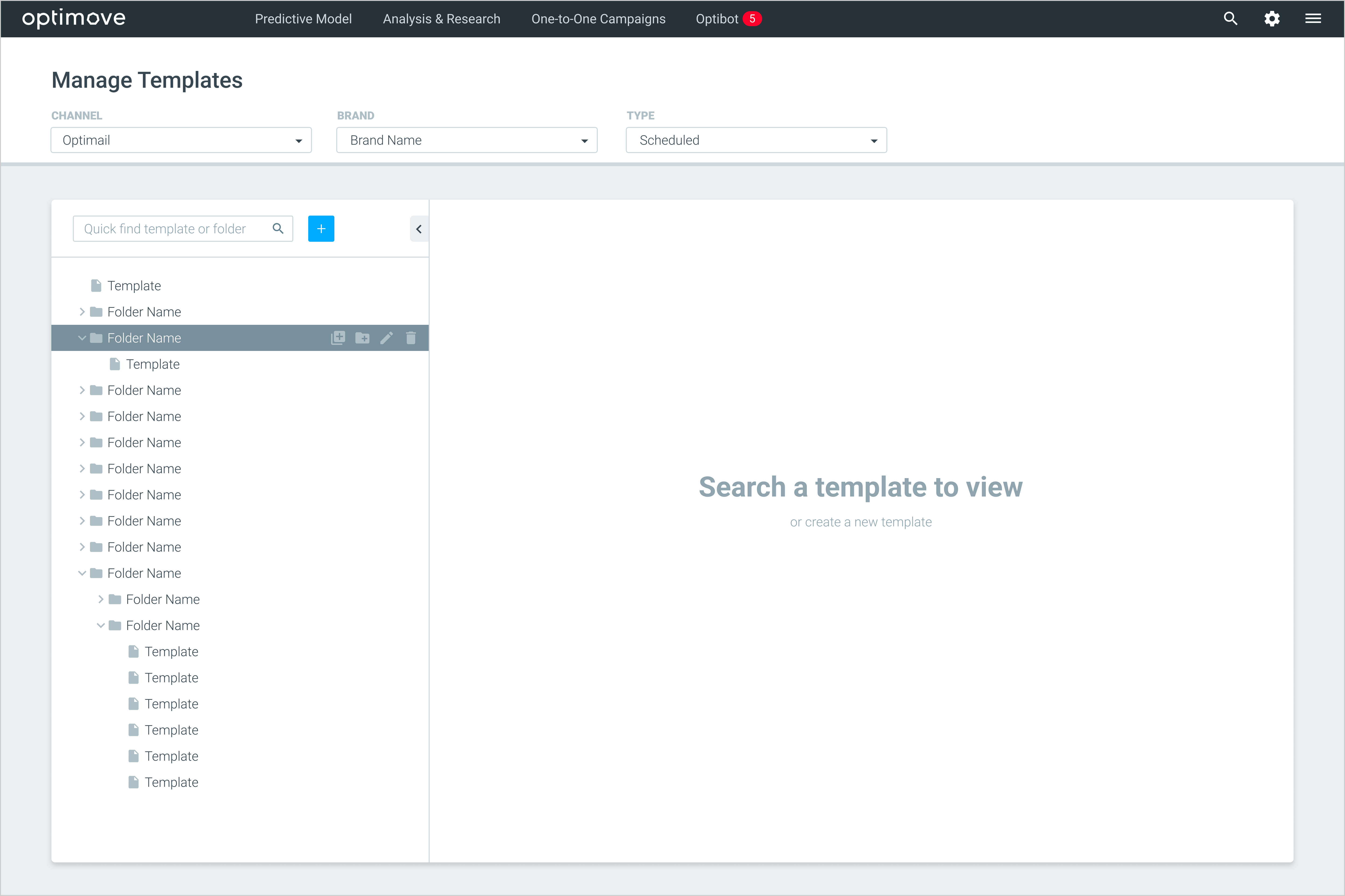
The "Manage Templates" screen combined template management with email editing in a single screen. The layout of this screen consisted of a left pane with folders and templates and a main workspace. This interface required users to use dropdowns to set the tree view for each channel and brand, which was not intuitive navigation. This setup led to inefficiencies in managing and editing templates.
Template Library: The folder pane was a long, mixed list of both folders and templates, making it difficult to differentiate between them. To find a specific template, users had to scroll through this list, which displayed only names. This setup forced users to rely on a complicated naming convention and often led to a trial-and-error approach to find the one they were looking for.

Template editor: The editor's limited space led to a non-immersive experience, with users frequently minimizing panels to reduce distractions and be able to focus on content.
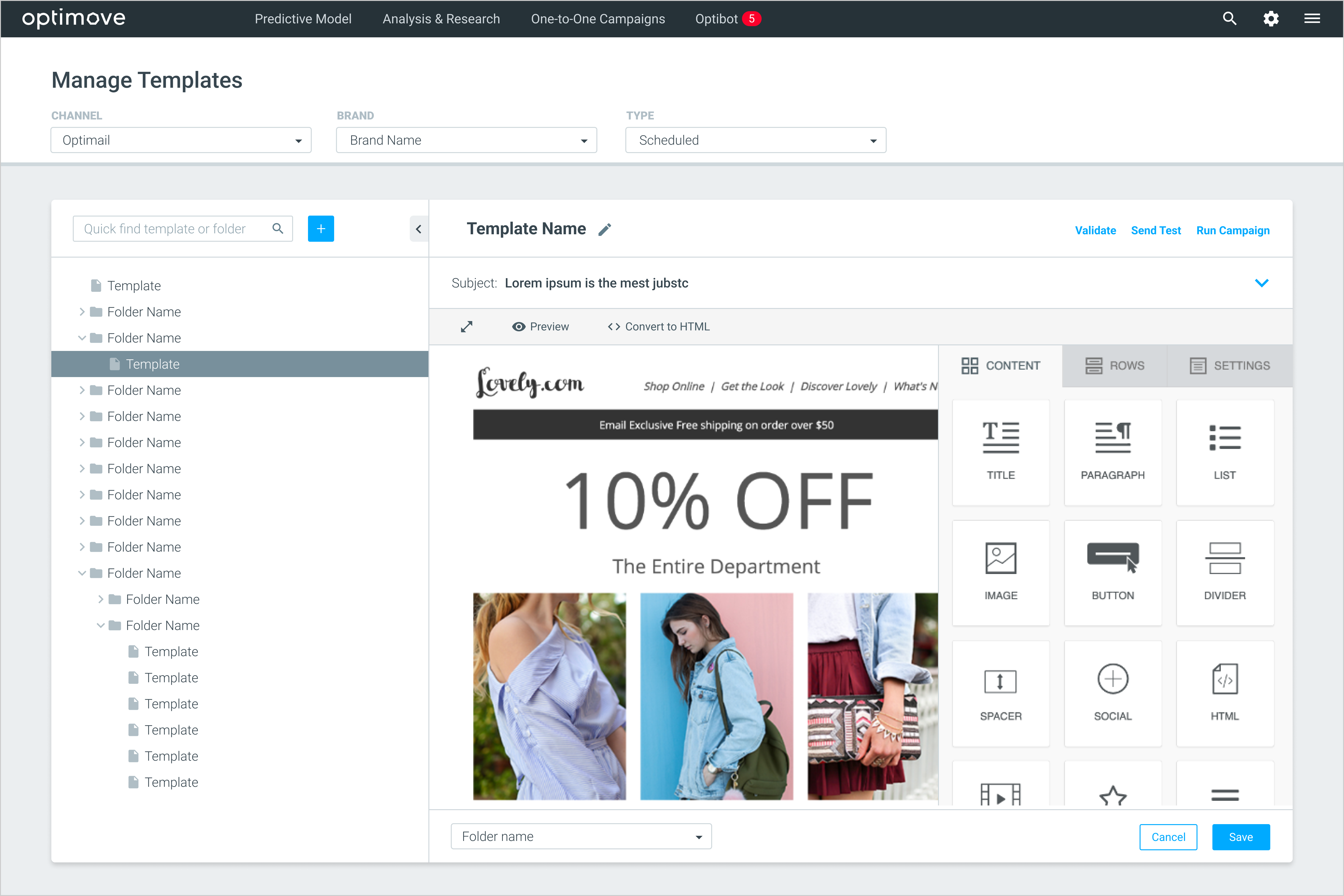
In addition, the interface lacked bulk action features, leading to inefficient, one-by-one management of templates. This, coupled with design limitations that restricted adding new features
When I began integrating the new channels into Optimove, I quickly faced a challenge with the existing design, realizing that our usual design didn't work well here. This led me to pivot towards a more user-centric strategy, starting with a deep dive into how users actually interacted with the product. This was crucial for pinpointing pain points and frictions they experienced while handling tasks related to templates.
Our main users, CRM managers, plan campaign templates in advance through strategic meetings. As they start creating these templates, they have detailed briefs containing essential assets like images and content. These teams vary significantly in size, roles, responsibilities, and workloads, reflecting the diverse nature of their tasks.
In interacting with the Optimove platform, these CRM managers typically engage in three main use cases:
Through interviews and observations, we conducted a task analysis to deeply understand user working flow. Our primary focus was on the campaign template creation process. The analysis showed that users typically find and duplicate an existing template, modifying its content, rather than creating one from scratch.

Our exploration focused on how we might design our platform to help users effortlessly find and identify the right templates without needing to open several for verification, while also creating an immersive and efficient content editing experience and enhancing action efficiency on templates?
We tried various concepts. One was Miller's Column, where users would select a channel and then delve deeper into the tree specific to that channel. Another idea was to show all channels and their trees in a single, unified view.

Ultimately, we decided to integrate channels into the main navigation of the platform. Our goal was to enable users to easily recognize the channel they needed to work on. By streamlining the navigation in this way, we removed an additional layer from the interface and reduced its complexity
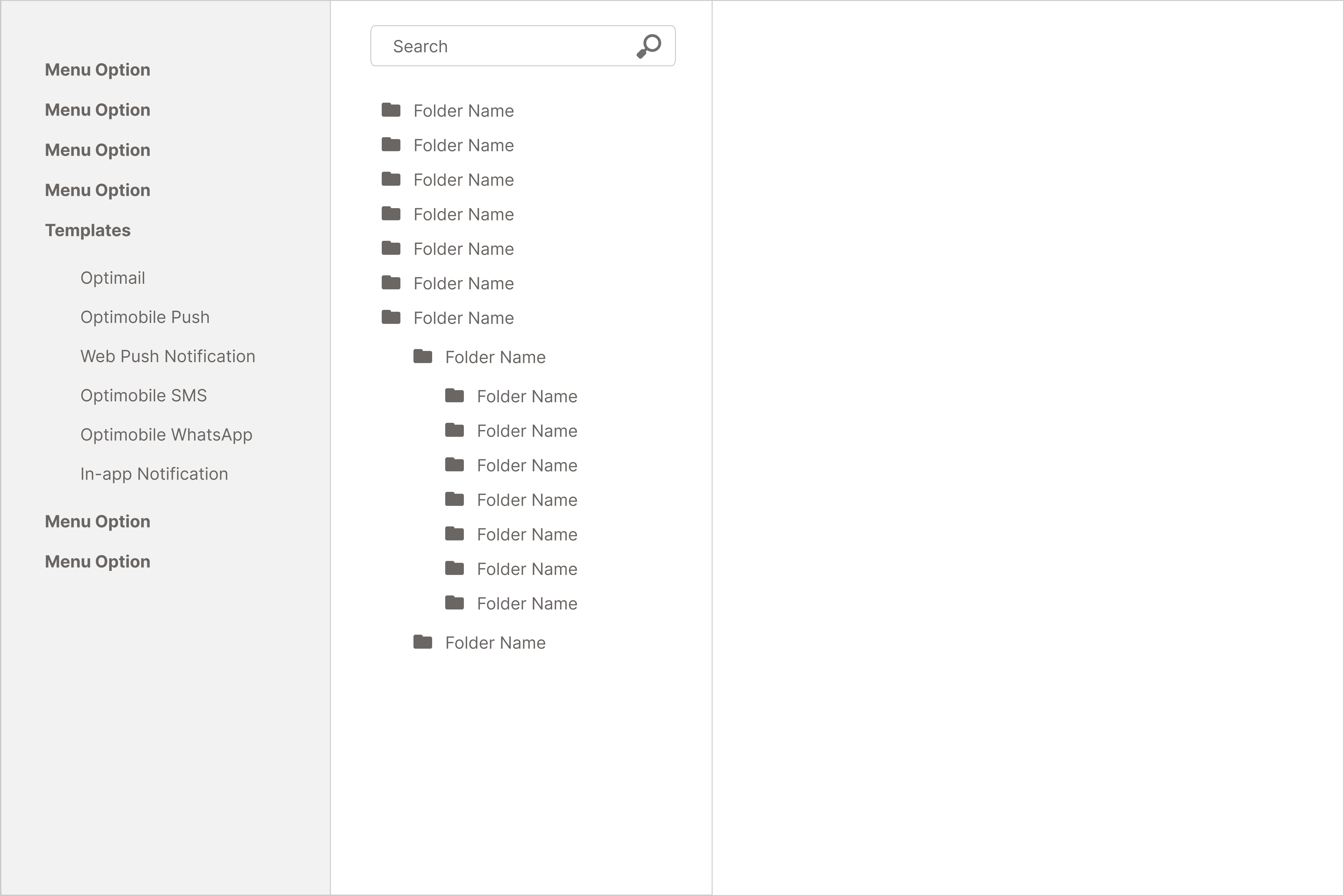
Having settled on our navigation model, we progressed to conceptualizing the template library. The side tree was now solely for folders, while the main area displayed the selected folder's contents.
We also enhanced each template's visibility in the library. Now, templates displayed key information upfront, allowing users to identify the right one without opening it or remembering its name.

Two significant issues came to light in the user testing of initial design. Firstly, users found the display of child folders in the main area confusing. Secondly, there was a clear demand for a quicker way to navigate between templates. Users wanted to make edits across different templates in a row without losing momentum or having to repeatedly navigate back and forth.
We've crafted the final design of the lobby screen with a keen focus on user feedback from our usability studies.
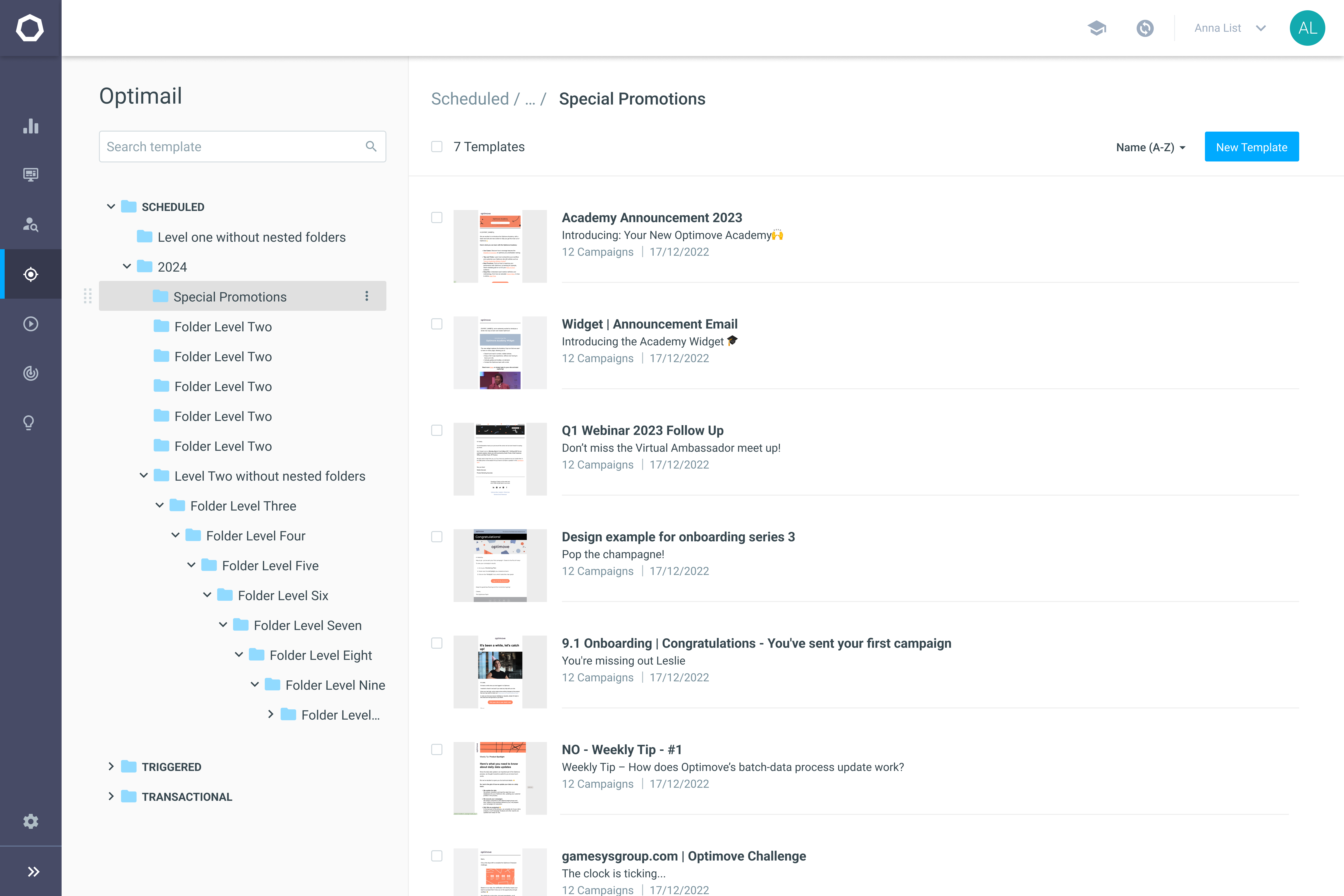
The updated search feature significantly simplifies the process of locating templates. Users no longer need to recall exact template names; they can effortlessly find templates by searching for terms in the subject line, within the content, or by folder name.
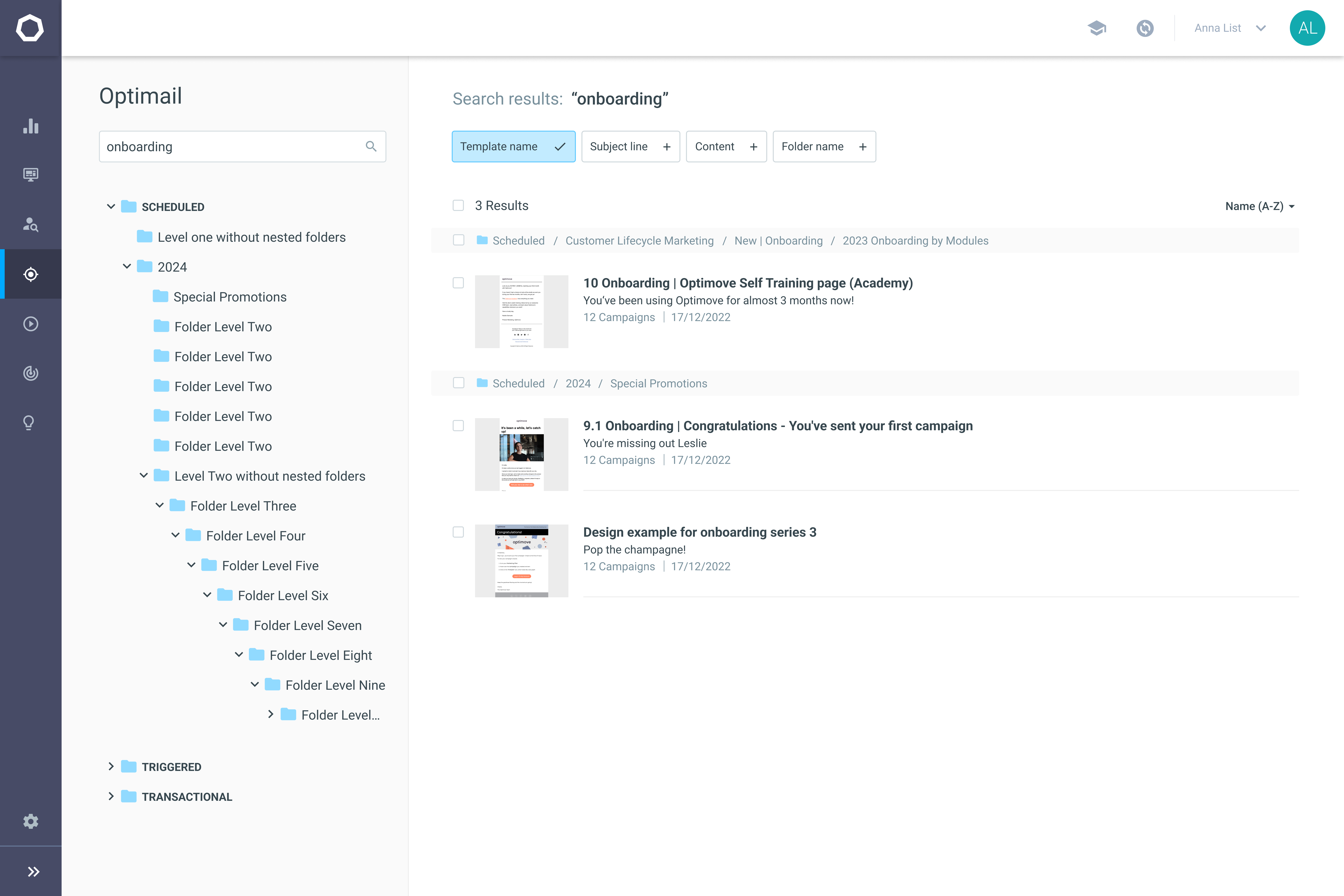
Batch actions allow users to change multiple templates in a row, acknowledging the common practice of working on several templates in a single session. This streamlines common tasks, significantly boosting user productivity.

The template item redesign includes workflow accelerators for improved efficiency. We've enhanced the duplicate feature for easier access and introduced new functionalities for immediate actions from this screen, like editing subject lines or sending tests for proofreading, reducing the need to open the editor.
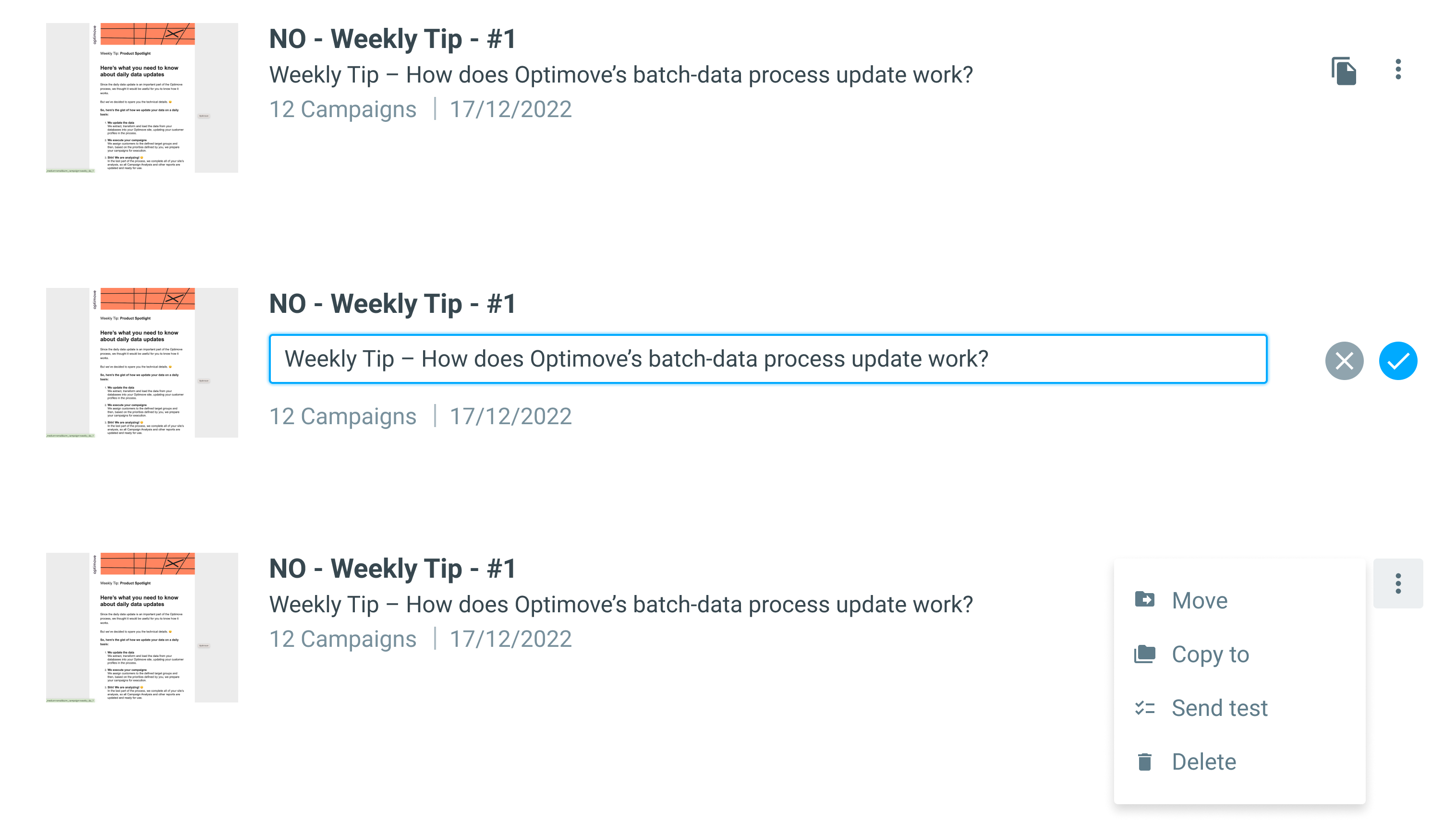
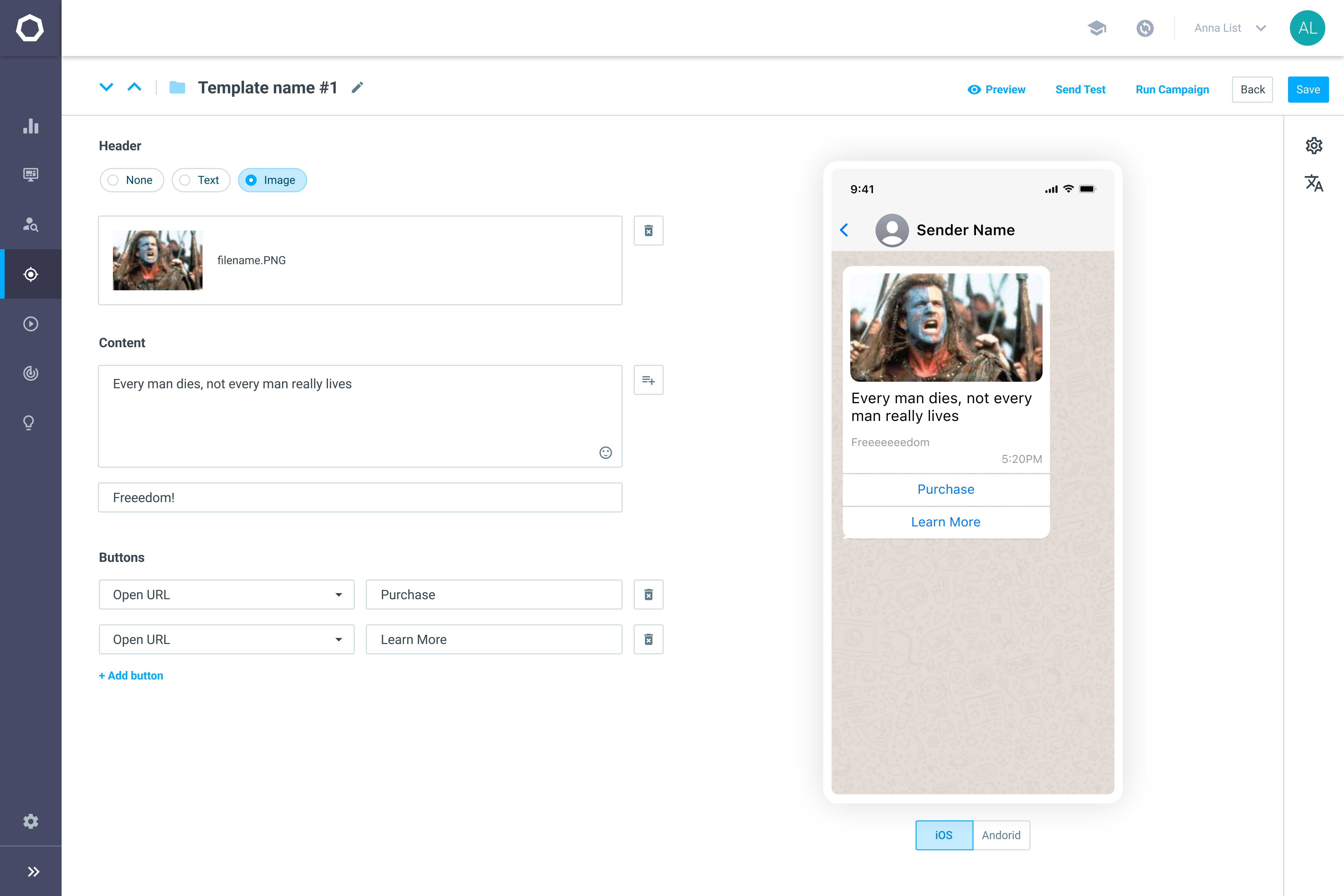
The editor now opens in a new, dedicated screen, creating a more immersive content editing environment. We designed two main types of editors:
WYSIWYG Channels: Tailored for channels like email and in-app notifications, which require customization and creativity.
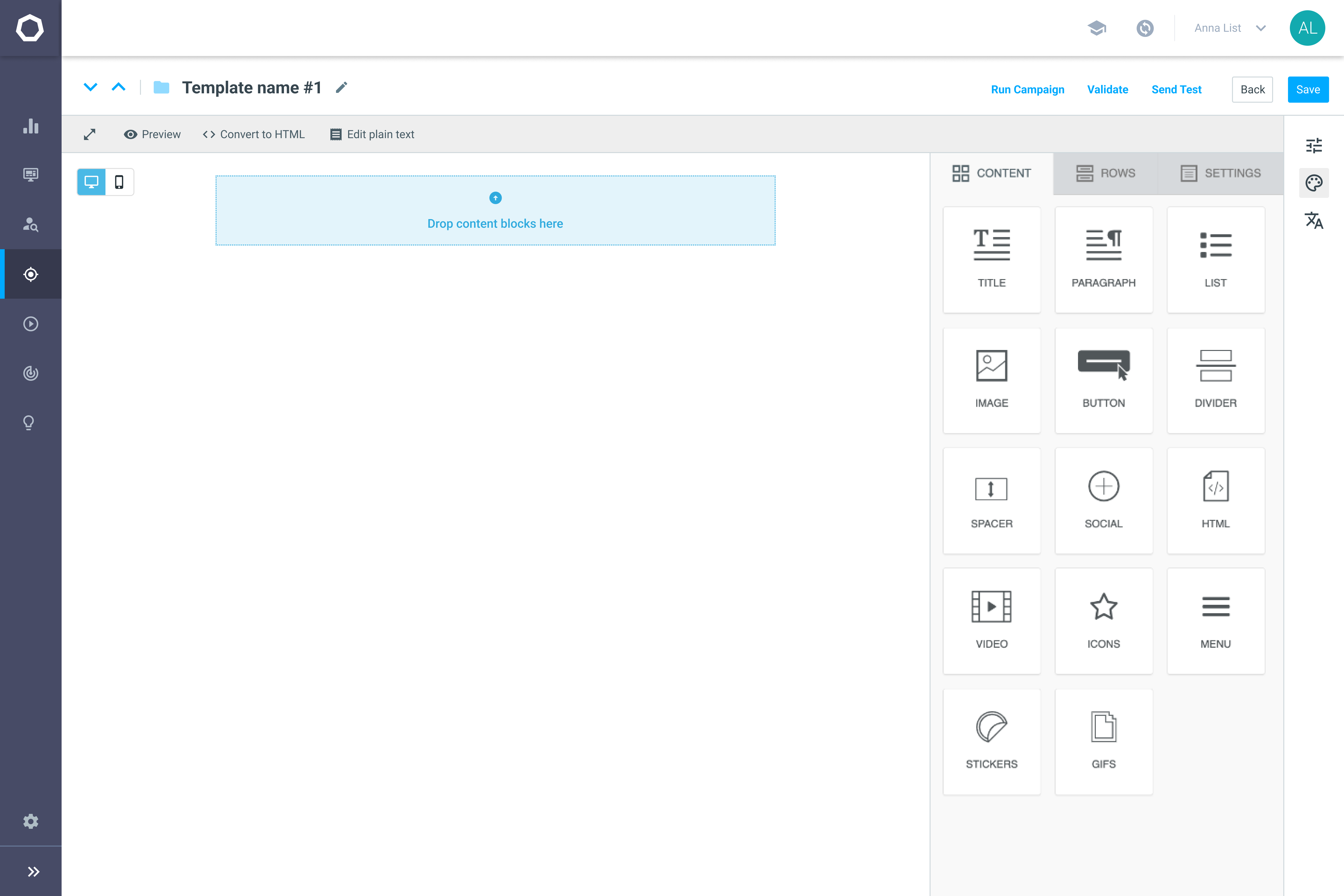
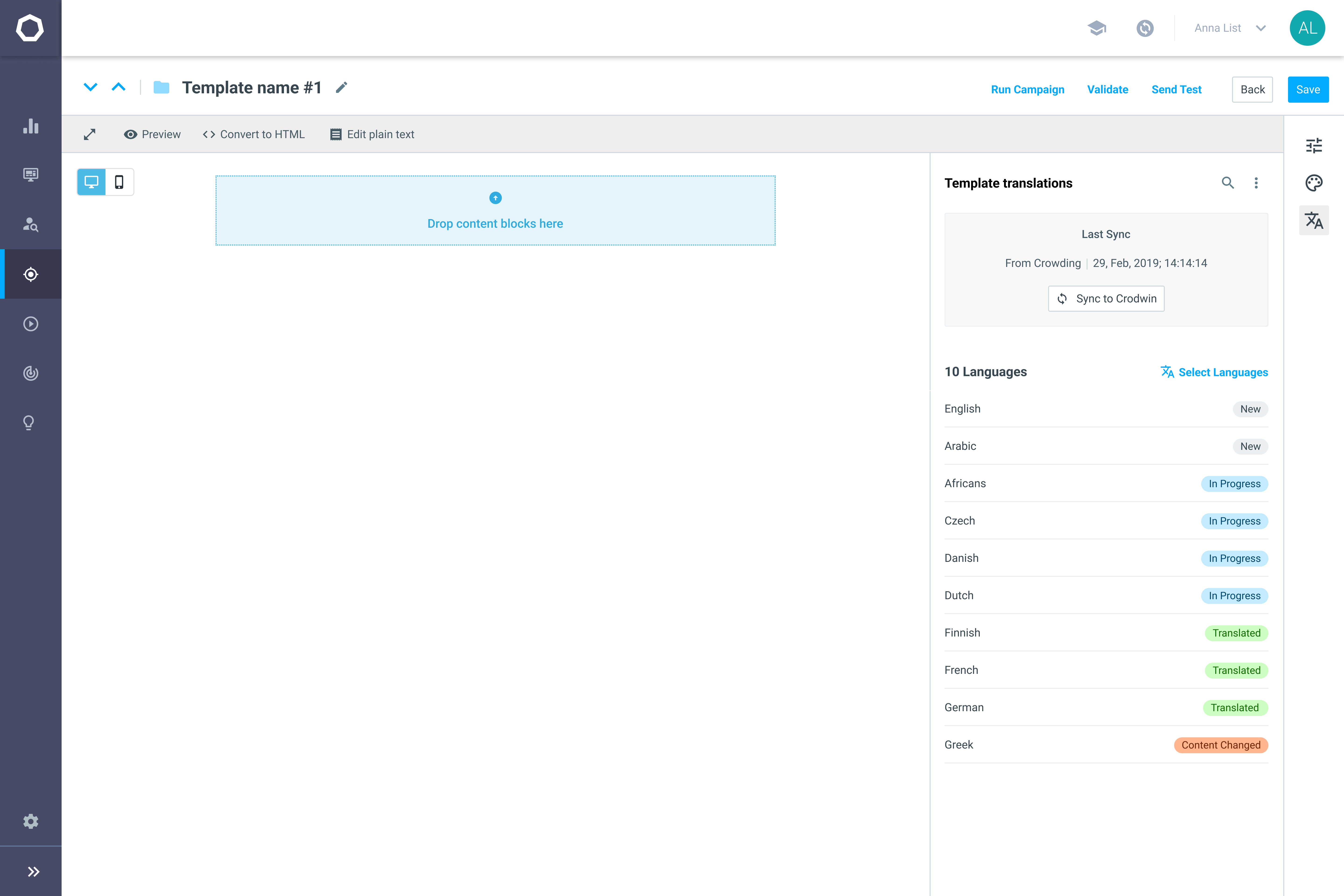
Its side rail provides easy scalability and access to various tools and settings, streamlining the editing process.
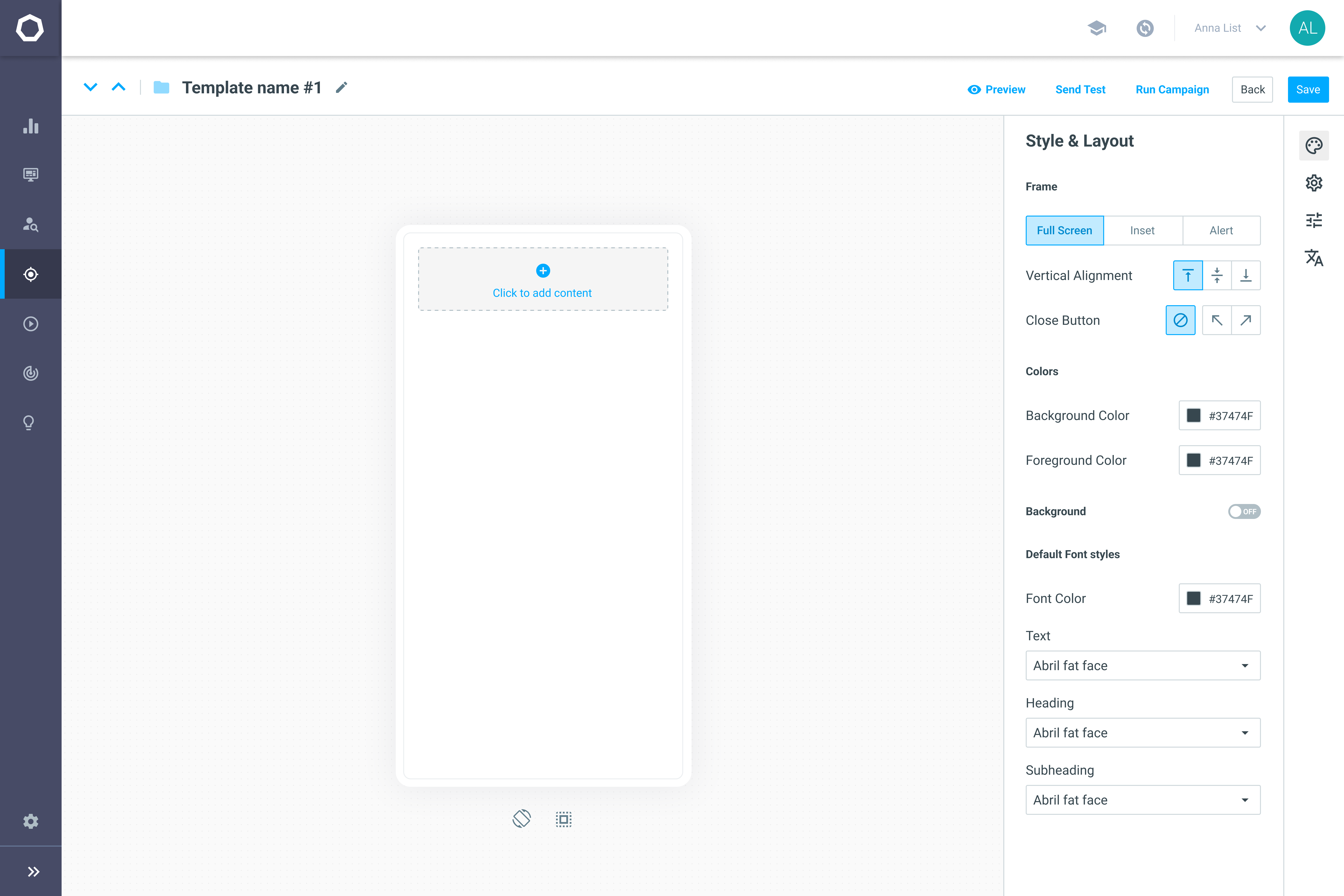
Form-Based Channels: Tailored for content-focused channels like SMS, push, or WhatsApp, with a dual layout of form and live preview.
Two significant issues came to light in the user testing of initial design. Firstly, users found the display of child folders in the main area confusing. Secondly, there was a clear demand for a quicker way to navigate between templates. Users wanted to make edits across different templates in a row without losing momentum or having to repeatedly navigate back and forth.
34%
Reduction of redundant template openings

The average number of page views per template in 30 days dropped from 7.9 to 5.2. This shows that our redesign made it easier to identify templates without opening multiple ones.
The new accelerators also enabled direct actions, reducing the need to open templates for certain tasks.
37%
Average uplift to omni-channel campaigns

Omni-channel campaigns saw over a 37% uplift compared to single-channel campaigns. This improvement validated our strategic acquisition of a mobile channels vendor.
A sales cycle with MyHeritage demonstrated the impact of our scalable interface design. They needed templates translated into 40 languages, a critical factor in their decision-making. Thanks to our scalable interface infrastructure, we easily added this feature, which played a pivotal role in improving the win rate.
